Typography for Branding: Choosing Fonts That Reflect a Brand’s Identity
In the digital age, where visual elements dominate consumer interactions, typography plays a crucial role in branding. Fonts are more than just letters on a screen—they are a visual representation of a brand’s identity and can significantly influence consumer perception. In this article, we will explore how to choose fonts that truly reflect your brand’s character, the impact typography has on branding, and practical tips for making effective choices.
The Importance of Typography in Branding
When it comes to brand identity, typography is a powerful yet often underestimated component. The fonts you choose communicate your brand’s values, personality, and essence. Here’s why typography is vital for branding:
- Immediate Recognition: Consistent use of typography can help establish a recognizable brand identity.
- Emotional Connection: Different font styles evoke different feelings; for example, serif fonts can convey tradition, while sans-serif fonts often feel modern and clean.
- Professionalism: Well-chosen typography speaks to your credibility and professionalism, influencing customer trust.
How to Choose Fonts That Reflect Your Brand’s Identity
Choosing the right fonts is more than just liking a certain style—it requires careful consideration of your brand’s mission and values. Here are steps to guide you through the selection process:
1. Define Your Brand Personality
Before diving into font selection, you must define your brand personality. Consider these questions:
- What are your brand values?
- Who is your target audience?
- What emotions do you want to evoke?
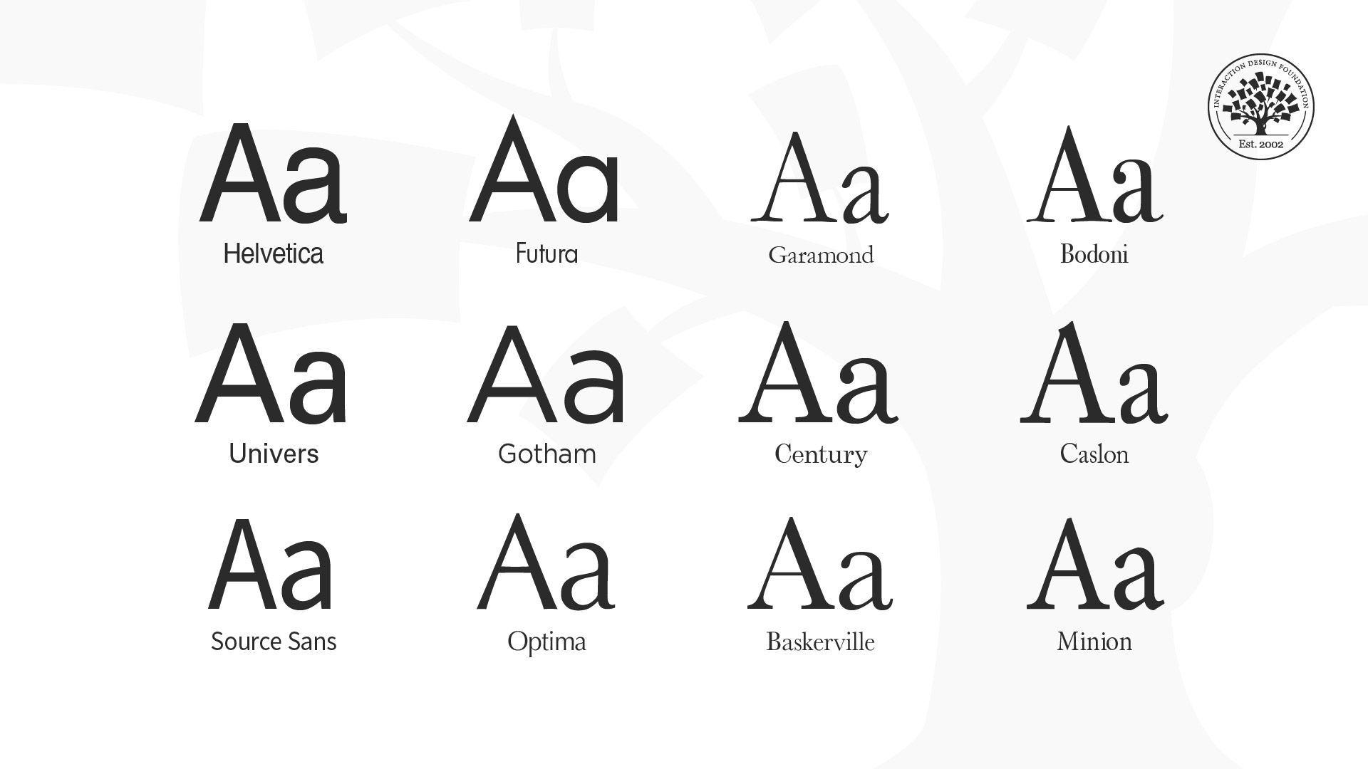
2. Understand Font Categories
Fonts come in various categories, each conveying different messages:
| Font Category | Description | Best Used For |
|---|---|---|
| Serif | Traditional, elegant fonts with small lines at the ends | Luxury brands, newspapers, and formal events |
| Sans-Serif | Modern, clean fonts without the small lines | Tech companies, casual brands, and startups |
| Script | Stylized, flowing fonts that mimic handwriting | Wedding invitations, beauty brands, and art-related businesses |
| Display | Unique, attention-grabbing fonts used for headlines | Event promotions, posters, and creative brands |
3. Consider Color Psychology
The colors you pair with your typography also play a significant role in how your fonts are perceived. Here’s a quick rundown of color psychology in branding:
- Red: Passion, excitement, urgency
- Blue: Trust, professionalism, calmness
- Green: Growth, health, nature
- Orange: Creativity, enthusiasm, warmth
Benefits of Using Appropriate Typography
Appropriate typography can bring numerous benefits to your brand:
- Enhanced Brand Recognition: Consistent typography creates a cohesive brand image.
- Improved Communication: Clear and legible fonts make it easier for audiences to digest your message.
- Increased Emotional Impact: Well-chosen fonts evoke the right feelings, enhancing customer engagement.
Practical Tips for Choosing Fonts
Here are some practical tips to refine your font selection process:
- Limit Your Font Choices: Stick to 2-3 complementary fonts to maintain visual harmony.
- Test Fonts in Context: Visualize your chosen fonts on actual branding materials to assess their effectiveness.
- Ensure Readability: Prioritize fonts that are easy to read across various sizes and devices.
- Gather Feedback: Get opinions from your audience to see how they perceive your typography.
Case Studies: Typography in Action
Examining successful brands can offer insights into the importance of typography in branding:
- Coca-Cola: Their iconic script font evokes feelings of nostalgia and joy, perfectly aligning with their brand identity.
- Google: The simple, modern sans-serif font reflects innovation and accessibility, appealing to a global audience.
- Harley-Davidson: The bold, rugged typography communicates strength and freedom, resonating deeply with their audience.
First-Hand Experience: Typography in My Branding Journey
As a content writer and brand strategist, I have seen firsthand how vital typography is to brand identity. When rebranding my own website, I spent hours analyzing various font styles and pairing options. After much experimentation, I settled on a clean sans-serif font for headlines and a classic serif for body text. The outcome was a modern yet sophisticated look that communicated my brand’s ethos effectively.
Conclusion
Choosing the right typography for branding is an essential part of creating a strong brand identity. By understanding your brand personality, exploring font categories, and considering color psychology, you can select fonts that resonate with your audience. Remember that typography is not just about aesthetics; it can create emotional connections, enhance recognition, and convey your brand’s values. Embrace the power of typography, and let it reflect your brand’s unique identity!


