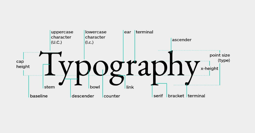
Typography is a fundamental aspect of web design that influences readability, user experience, and visual appeal. By applying best practices, web developers and designers can create aesthetically pleasing, accessible, and user-friendly websites. This guide explores essential web typography principles and techniques to ensure your designs stand out while providing a seamless reading experience.
Why Typography Matters in Web Design
Typography enhances communication by influencing how content is perceived. It creates a hierarchy, guides users’ focus, and improves readability, ultimately affecting user retention. Good typography fosters trust and credibility, making users more likely to engage with your content.
“Typography is the craft of endowing human language with a durable visual form.” – Robert Bringhurst
1. Choosing the Right Typeface
The choice of typeface sets the tone for your website. Serif fonts convey tradition and formality, while sans-serif fonts offer a modern, clean look. Script and display fonts can add flair but should be used sparingly.
Best Practices for Typeface Selection:
- Consistency: Use no more than two to three typefaces across your website to maintain consistency.
- Readability: Prioritize legibility over aesthetics, especially for body text.
- Accessibility: Ensure your typefaces support different character sets and languages.
2. Establishing a Typographic Hierarchy
A clear hierarchy guides readers through your content by distinguishing headings, subheadings, and body text. Use font sizes, weights, and colors strategically to create a logical reading flow.
Best Practices for Typographic Hierarchy:
- Headings: Use larger, bold fonts for primary headings.
- Subheadings: Slightly smaller and lighter fonts help define sections.
- Body Text: Maintain a standard size (typically 16px) for optimal readability.
Related reading: Mastering CSS Basics: The Key to Stunning Web Design
3. Using Line Height and Letter Spacing
Line height (leading) and letter spacing (tracking) greatly influence readability. Proper spacing prevents text from feeling cramped or overly sparse.
Best Practices for Spacing:
- Line Height: Set line height between 1.4 to 1.6 times the font size for body text.
- Letter Spacing: Use tighter spacing for headings and wider spacing for body text for improved clarity.
4. Responsive Typography with CSS
Incorporating responsive design ensures that typography adjusts across different devices and screen sizes. CSS techniques like relative units (em, rem) enable scalable typography.
Using CSS for Responsive Typography:
- Media Queries: Define different font sizes for various screen widths.
- CSS Variables: Store font sizes and apply consistent values across your website.
Explore more: Introduction to Flexbox: The Essential Guide for Modern Web Layouts
“Good design is as little design as possible.” – Dieter Rams
5. Combining Typography with CSS Grid and Flexbox
CSS Grid and Flexbox are powerful tools for aligning and distributing text within layouts. Grid provides structured alignment, while Flexbox excels at handling dynamic and flexible text arrangements.
Practical Tips for Layouts:
- Grid: Use grid-template-areas to organize text blocks.
- Flexbox: Align text with justify-content and align-items for balanced layouts.
Further reading: Understanding CSS Grid Basics
6. Ensuring Accessibility with Web Typography
Accessibility is crucial for reaching a broader audience, including users with visual impairments. Accessible typography enhances usability and aligns with Web Content Accessibility Guidelines (WCAG).
Accessibility Guidelines:
- Contrast Ratio: Ensure text color contrasts sufficiently with the background.
- Alt Text: Describe images with meaningful text to aid screen readers.
- Scalable Text: Allow users to adjust font size without breaking the layout.
7. The Importance of Performance Optimization
Typography can impact page load speed if not managed correctly. Use web-safe fonts and font subsets to optimize performance. Consider modern formats like WOFF2 for faster loading.
Optimization Techniques:
- Font Loading: Use the
font-displayproperty to control how fonts load and render. - Minimize File Size: Compress fonts and avoid unnecessary font weights.
Typography is a powerful tool that shapes how users interact with your content. By following these best practices, you can create visually appealing, accessible, and user-friendly websites that enhance user engagement.
Adopting effective typographic strategies ensures a positive user experience, building trust and credibility. Start refining your web typography today for a lasting impact!