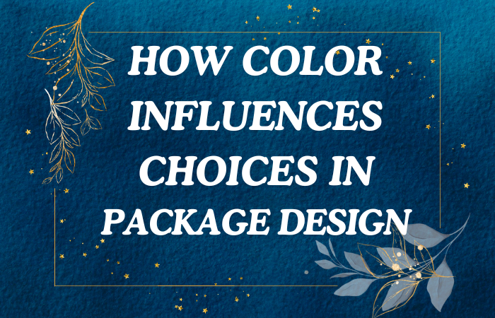
Color is one of the most powerful tools in a designer’s arsenal, especially when it comes to packaging design. It has the ability to evoke emotions, shape perceptions, and influence consumer behavior. In fact, research suggests that color can affect up to 90% of a consumer’s decision to buy a product. Whether it’s grabbing attention on a crowded store shelf, conveying brand values, or creating an emotional connection with consumers, color plays a critical role in packaging design choices.
In this blog post, we’ll explore how color influences packaging design, the psychological impact of different colors, and how brands can strategically use color to create compelling packaging that resonates with their target audience.
1. The Psychology of Color in Packaging Design
Color psychology refers to how colors affect human behavior and emotions. In the context of packaging design, the right color choices can create powerful associations with a brand and its products, influencing how consumers perceive and interact with them.
Different colors evoke different emotional responses, which is why selecting the appropriate colors for packaging is crucial. Let’s take a closer look at some common colors and the emotions they typically evoke in consumers:
- Red: Passion, energy, and urgency. Red is a bold and attention-grabbing color often associated with excitement, love, and intensity. It’s frequently used in packaging for products that need to evoke strong emotions or prompt impulse purchases, such as snacks, beverages, or beauty products.
- Blue: Trust, calmness, and professionalism. Blue is often associated with feelings of security, reliability, and tranquility. It’s commonly used in packaging for health, beauty, and tech products because it conveys trustworthiness and peace.
- Green: Nature, health, and sustainability. Green is strongly linked to the natural world and is often used in packaging for eco-friendly, organic, or health-conscious products. It creates a sense of freshness and wholesomeness, which is why it’s popular in food packaging as well as products focused on wellness.
- Yellow: Happiness, optimism, and warmth. Yellow is a bright and cheerful color that evokes positivity and energy. It’s frequently used in packaging for products that aim to lift spirits or appeal to younger audiences, such as children’s toys or snacks.
- Black: Luxury, elegance, and sophistication. Black conveys a sense of exclusivity and high-end appeal. It’s commonly used in packaging for luxury products, such as cosmetics, perfumes, or high-end tech gadgets, to create a sleek and premium look.
- White: Simplicity, purity, and cleanliness. White is often associated with minimalism and purity. It’s used in packaging for products where simplicity and cleanliness are key messages, such as personal care items, household products, or tech devices.
- Purple: Royalty, creativity, and spirituality. Purple has long been associated with luxury, wisdom, and creativity. It’s often used in packaging for premium products or those related to beauty, wellness, and indulgence.
- Orange: Fun, energy, and enthusiasm. Orange is an energetic and playful color that grabs attention. It’s used in packaging for products that want to convey excitement or a sense of adventure, such as sports equipment, beverages, or snack foods.
Each color has its own psychological impact, and understanding this can help brands create packaging that aligns with the emotions they want to evoke in their target audience.
2. Color and Brand Identity
When consumers look at packaging, they’re not just seeing the product; they’re engaging with the brand. Color is one of the most crucial elements that help build and reinforce brand identity. A brand’s color palette should reflect its values, personality, and target market. Consistency in color choices across packaging and other brand materials helps strengthen brand recognition.
Examples of Color in Brand Identity:
- Coca-Cola (Red): Coca-Cola’s iconic red packaging is synonymous with the brand’s values of excitement, happiness, and energy. The bold red packaging is instantly recognizable and creates a sense of connection with consumers worldwide.
- Apple (White): Apple’s use of clean white packaging aligns with its brand identity of simplicity, innovation, and elegance. The minimalist design paired with the white color scheme reinforces the brand’s reputation for sleek, modern products.
- Tiffany & Co. (Blue): The famous “Tiffany Blue” box is a hallmark of luxury and sophistication. The unique shade of blue has become an essential part of the brand’s identity, symbolizing elegance, exclusivity, and timeless beauty.
- McDonald’s (Yellow & Red): McDonald’s signature yellow and red color scheme is designed to evoke feelings of happiness, energy, and excitement. Red stimulates appetite, while yellow is associated with friendliness and warmth, making it a perfect combination for a fast-food brand.
Color consistency across packaging creates a visual link between the product and the brand. When consumers see the color, they automatically associate it with the brand’s values and personality, which builds trust and loyalty over time.
3. Using Color to Stand Out on Shelves
In a retail environment, products often compete for attention on crowded shelves. Packaging design plays a key role in helping products stand out, and color is one of the most effective ways to achieve this.
Strategies for Standing Out with Color:
- Contrasting Colors: Using contrasting colors in packaging design can help products stand out in a sea of competitors. For example, a product with a bright orange box on a shelf filled with neutral tones will naturally draw attention.
- Unique Color Choices: Choosing unexpected or unusual color combinations can create a sense of curiosity and intrigue. For example, a beauty brand might choose deep purples or blues instead of the typical pastels associated with skincare, which helps differentiate the product from competitors.
- Bold Accents: Even if a brand’s primary color palette is neutral or subdued, incorporating bold accent colors can make the packaging more eye-catching. A small pop of color on a minimalist package can make the product feel more modern and engaging.
- Seasonal Color Changes: Some brands use seasonal colors to refresh their packaging and attract attention during different times of the year. For instance, a brand might incorporate warm, festive colors during the holiday season or fresh, pastel tones for spring. This helps create excitement and keeps consumers engaged with the brand throughout the year.
4. Cultural Implications of Color
Color perceptions vary across cultures, and brands need to be mindful of cultural differences when designing packaging for global markets. A color that conveys positive emotions in one culture might have different connotations in another.
For example:
- White: In many Western cultures, white is associated with purity and cleanliness, making it a popular choice for healthcare and beauty products. However, in some Eastern cultures, white is associated with mourning and death.
- Red: Red symbolizes excitement and passion in many Western cultures, but in China, red is considered a lucky color associated with prosperity and celebration.
- Green: While green is linked to nature and health in Western countries, it can have different meanings in the Middle East, where it represents luck and fertility.
Understanding these cultural nuances is essential for brands that operate in multiple markets. Tailoring color choices to the cultural context can enhance the appeal of packaging and ensure that it resonates positively with local consumers.
5. Color and Consumer Preferences
Different colors appeal to different demographics and product categories. Age, gender, and personal preferences all influence how consumers respond to certain colors.
Gender Preferences:
- Men tend to prefer darker, more muted colors like black, blue, or green. This is why many products targeted at men, such as grooming products or electronics, often use these colors in their packaging.
- Women, on the other hand, are often drawn to brighter or softer colors, such as pastels or vibrant shades of red, pink, or purple. Beauty and skincare products frequently use these colors to appeal to their female audience.
Age Preferences:
- Children respond to bright, bold colors like red, yellow, and blue. Packaging for toys, snacks, and children’s clothing often features vibrant colors that capture attention and convey a sense of fun.
- Teenagers tend to prefer trendy or edgy colors, like neon or metallic shades, especially for products related to fashion, beauty, or tech.
- Adults often appreciate more sophisticated and muted color palettes, such as neutrals, earth tones, or monochromatic schemes, especially for products related to home goods, personal care, and food.
Brands need to consider their target demographic when choosing packaging colors. Understanding consumer preferences allows brands to select colors that resonate with their audience and drive purchasing decisions.
6. Eco-Friendly Packaging and Color Trends
As sustainability becomes a key concern for both brands and consumers, the trend of eco-friendly packaging has brought new color trends to the forefront. Many brands are using natural, earthy tones to communicate their commitment to sustainability and environmental responsibility.
Colors like beige, green, brown, and muted pastels are often associated with eco-friendly products. These colors evoke a sense of nature, purity, and simplicity. For example, brands selling organic or vegan products may opt for packaging that uses shades of green or kraft paper tones to emphasize the natural and sustainable aspects of their products.
Eco-friendly packaging also embraces minimalism, with brands opting for fewer colors or monochromatic designs to reduce the use of inks and dyes, further emphasizing their commitment to reducing their environmental footprint.
7. Testing and Refining Color Choices
While color theory and psychology can guide initial color choices for packaging design, testing is essential to ensure the colors resonate with the target audience. Many brands conduct focus groups, A/B testing, or surveys to gauge consumer reactions to different color options.
Why Testing Color is Important:
- Understanding Consumer Reactions: Testing helps brands identify whether the chosen colors are creating the desired emotional response in consumers.
- Improving Brand Recall and Recognition: Testing can reveal which color combinations help with brand recall and ensure that the packaging design is memorable to consumers.
- Optimizing for Sales: By understanding how different colors impact consumer behavior, brands can refine their packaging to boost sales and enhance product appeal.
For example, a brand might test different shades of blue on its packaging to see which resonates best with its target audience or whether introducing a bold accent color improves the overall design’s impact.
Tools for Color Testing
There are various methods brands can use to test the effectiveness of their packaging color choices:
- A/B Testing: Present two versions of packaging with different color schemes to a group of consumers and measure which performs better in terms of appeal and perceived value.
- Focus Groups: Gather feedback from a diverse group of individuals to assess their emotional responses and perceptions of different packaging colors.
- Surveys: Conduct online or in-person surveys to gather insights into consumer preferences and their likelihood of purchasing based on color design.
Digital Color Testing
In addition to traditional testing methods, digital tools such as mockups and simulations can help visualize how colors will look on packaging before finalizing the design. This allows designers to experiment with various color combinations and refine their choices to ensure they align with the brand’s objectives.
Conclusion
Color plays a vital role in packaging design, influencing how consumers perceive products and shaping their purchasing decisions. By understanding the psychology of color, brands can create packaging that resonates with their target audience, reinforces brand identity, and helps products stand out on the shelves. Whether it’s evoking emotions, conveying brand values, or signaling sustainability, color has the power to transform packaging into a key marketing tool.
Brands need to carefully consider cultural implications, consumer preferences, and market trends when selecting colors for their packaging. By testing and refining color choices, companies can create packaging designs that not only attract attention but also enhance brand recognition and loyalty. Ultimately, the right use of color can be the difference between a product blending in and one that stands out, drives sales, and creates lasting consumer connections.