In today’s fast-paced digital landscape, having a mobile-friendly website isn’t just a luxury—it’s a necessity. With more than 50% of global web traffic coming from mobile devices, optimizing your website for mobile is crucial. Whether you’re running an e-commerce store, a blog, or a corporate website, a mobile-optimized design ensures a better user experience and higher engagement, ultimately boosting your conversions and search engine rankings.
Partnering with a freelance designer who specializes in mobile-friendly websites can make the process easier. Here’s a step-by-step guide on how to ensure your website is mobile-friendly, with the expertise of a freelance designer.
1. Understand the Importance of Mobile-Friendly Design
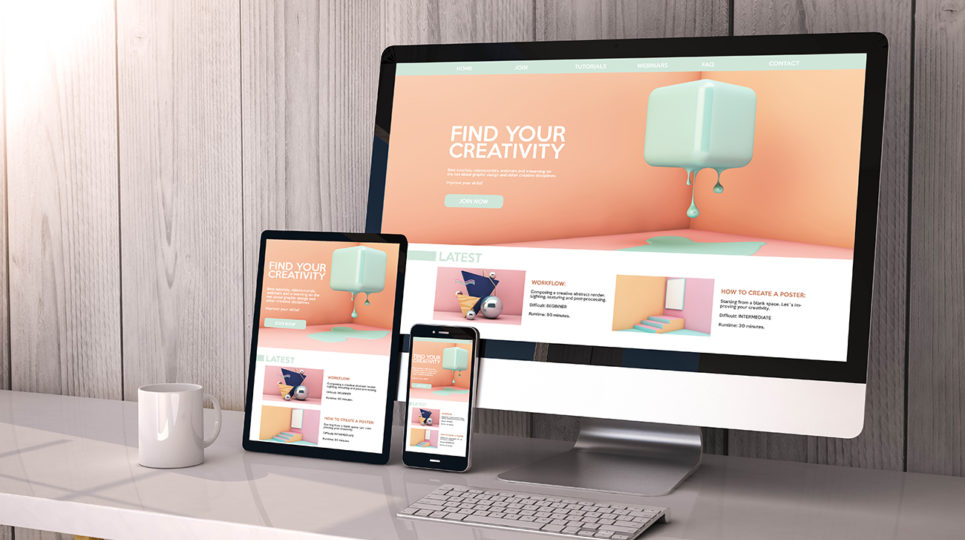
The first step to making your website mobile-friendly is recognizing the significance of a responsive design. Mobile-friendly websites automatically adjust their layout, images, and content to fit smaller screens. This not only enhances the user experience but also ensures that visitors can easily access your website regardless of the device they are using.
A responsive website isn’t just about resizing elements; it’s about creating an interface that is easy to navigate, quick to load, and aesthetically pleasing on smaller screens. Freelance designers can apply various design principles to help achieve this. A mobile-first design approach is key, which means designing the mobile version of your website first before scaling up for desktops.
For e-commerce businesses, ensuring that your website is mobile-friendly is especially important. If you are running an online store, a website that looks great and works seamlessly on mobile can directly impact your sales. Hiring a web designer with e-commerce experience will ensure that your site is optimized for both mobile browsing and purchasing, making it easy for customers to shop on-the-go.
2. Choose the Right CMS Platform for Mobile Optimization
One of the key factors in mobile-friendliness is the content management system (CMS) you use. The CMS you choose will have a significant impact on your website’s responsiveness and overall mobile performance. Freelance designers with experience in WordPress, Shopify, Squarespace, or Wix can help you select the right platform based on your website’s goals.
Certain CMS platforms come with mobile-optimized templates and themes, making it easier to design a mobile-friendly site without having to code from scratch. However, some platforms are more mobile-friendly than others, so it’s important to work with a designer who can recommend the best CMS for your needs.
For instance, Shopify is widely known for its e-commerce capabilities, and it has many mobile-responsive themes. On the other hand, WordPress offers a range of themes and plugins designed specifically for mobile optimization. To learn more about the best CMS platforms for your website, take a look at this guide on the top 5 CMS platforms freelancers should know in 2025.
3. Focus on User Experience (UX) and Interface Design

A mobile-friendly website goes hand-in-hand with excellent user experience (UX). When designing a mobile-optimized site, your freelance designer should focus on several factors to enhance usability, including:
- Simplified Navigation: Mobile screens are limited in size, so it’s crucial to streamline the navigation menu. Large buttons and drop-down menus can clutter the screen, so simplifying the navigation with icons, hamburger menus, and sticky headers can improve the user experience.
- Readable Fonts: Text should be legible without requiring users to zoom in. Using appropriate font sizes and contrast will make reading easier on mobile devices.
- Responsive Media: Images and videos should resize based on the screen size, ensuring they don’t slow down the website’s load times. Freelance designers use responsive images that automatically adjust to the device.
In addition to these features, integrating Single Page Applications (SPAs) can help optimize the mobile experience. SPAs load content dynamically, reducing the need to reload entire pages, which boosts the website’s speed. As stated in Mastering Single Page Applications (SPAs), SPAs offer a smoother browsing experience, which is especially beneficial for mobile users who may have slower internet speeds.
“Mobile optimization is more than just a technical requirement—it’s about creating a smooth and enjoyable experience for your visitors. A good freelance designer will ensure that your site is user-friendly, responsive, and optimized for all devices.” – Bryan Copperfield, Web Development Expert
4. Prioritize Mobile SEO
Designing a mobile-friendly website goes beyond the visual elements—it also involves making sure your website is optimized for mobile SEO. Google has transitioned to mobile-first indexing, meaning that it ranks mobile-friendly websites higher than those that are not optimized for mobile.
Freelance designers should ensure that your mobile site is fully optimized for SEO. This includes:
- Optimizing Images: Large images can slow down your site on mobile devices, so designers should use image compression techniques and implement lazy loading to improve performance.
- Mobile-Friendly Meta Tags: Ensuring your website’s meta tags, such as title tags and meta descriptions, are optimized for mobile search results is key to enhancing visibility.
- Improving Site Speed: Mobile users expect fast loading times. A good designer will ensure that your website is optimized for speed, which includes optimizing code, images, and using a content delivery network (CDN).
5. Test Your Website on Multiple Devices
Before launching your mobile-friendly website, it’s important to test it across multiple devices and browsers. Freelance designers use testing tools such as Google’s Mobile-Friendly Test or BrowserStack to ensure that your site looks and performs well on various screen sizes.
Testing helps identify any glitches, such as text cut-off, slow load times, or unresponsive buttons. This ensures that users have a consistent experience, whether they’re accessing your site on a smartphone, tablet, or laptop.
6. Continuous Maintenance and Updates
Mobile optimization isn’t a one-time task—it requires ongoing attention. As mobile technologies evolve, your website will need to be updated to stay compatible with new devices, operating systems, and browsers. Freelance designers can provide continuous support to keep your website up to date and ensure it remains mobile-friendly in the long term.
Conclusion
Ensuring that your website is mobile-friendly requires careful planning and the right expertise. By working with a skilled freelance designer, you can create a website that not only looks great on mobile devices but also offers a seamless and enjoyable experience for visitors. From choosing the right CMS platform to optimizing for mobile SEO and UX, a freelance designer can help you navigate the complexities of mobile design and ensure your website stays ahead of the competition.