Creating websites that adapt to different screen sizes is crucial for an optimal user experience. This is where Flexbox and CSS Grid come into play. Both tools are essential for designing responsive layouts, but understanding when to use each one can make all the difference in your web development projects.
What are Flexbox and Grid?
Flexbox: One-Dimensional Layout
Flexbox is a layout model designed for handling single-axis layouts, either in rows or columns. It’s perfect for tasks like centering content, creating navigation bars, or evenly spacing items.
Here’s a basic example of a Flexbox container:
cssCopy code.flex-container {
  display: flex;
  justify-content: space-around;
  align-items: center;
}
This code aligns items along the main axis, making the layout responsive without extra media queries.
CSS Grid: Two-Dimensional Layout
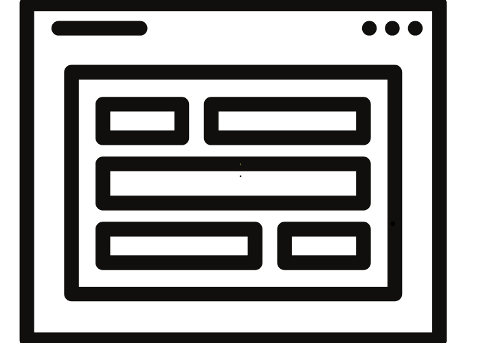
While Flexbox is great for simpler, linear layouts, CSS Grid is designed for more complex, two-dimensional layouts. It allows you to create intricate designs using rows and columns effortlessly.
For instance, here’s a simple CSS Grid layout:
cssCopy code.grid-container {
  display: grid;
  grid-template-columns: repeat(3, 1fr);
  gap: 15px;
}
This setup creates a responsive three-column layout. It’s particularly useful for building gallery sections, complex page structures, or content grids. To effectively gauge a developer’s skills in using Flexbox and Grid, performing code reviews is recommended. Learn more about how to conduct them in this guide on assessing developer expertise.
Choosing Between Flexbox and Grid
When it comes to responsive design, knowing when to use Flexbox versus CSS Grid can be a game changer:
- Use Flexbox for simpler, single-axis layouts like navigation bars or card components.
- Choose CSS Grid for more complex, two-dimensional layouts, such as dashboard interfaces or multi-section pages.
Often, combining both tools yields the best results. For example, you might use Flexbox for arranging a navigation bar and CSS Grid for structuring the main content area.
Tips for Building Responsive Designs
- Combine Flexbox and Grid Strategically: Leverage the strengths of each layout model to enhance responsiveness.
- Incorporate Media Queries: While Flexbox and Grid are naturally responsive, using media queries can refine the design for specific devices.
- Find Skilled Developers: If you’re looking for developers with strong expertise in responsive design, consider using the Efrelance project search tool. It helps match you with professionals skilled in modern CSS techniques.
- Check Developer Ratings: To ensure you hire the best fit, you can evaluate developer ratings using this guide on assessing full-stack developer ratings.
“Responsive design isn’t about creating the perfect layout for each device; it’s about building a layout that adapts smoothly to any screen size.“
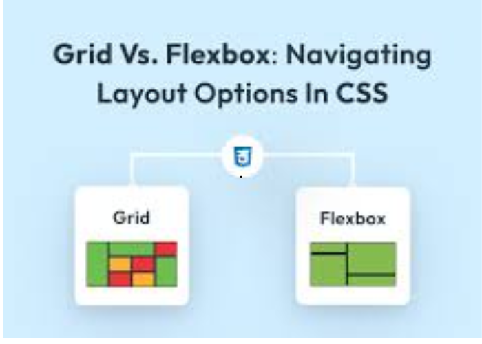
Flexbox vs. Grid: A Visual Comparison
Both Flexbox and Grid offer unique strengths. Flexbox excels in simpler layouts, while CSS Grid handles complex structures with ease. For most projects, a blend of the two approaches provides the most flexibility.
Conclusion
Mastering Flexbox and Grid is essential for creating responsive, user-friendly websites. Whether you are developing a new site or improving an existing one, these tools can help you build layouts that look great on any device. Remember, testing your design on multiple devices and evaluating developers with the right expertise can significantly enhance your project’s outcome.

