When creating a presentation, color is more than just a design element—it can influence emotions, guide focus, and enhance message retention. Understanding the psychology of color can help you create presentations that resonate with your audience on a deeper level, evoking the right emotions and reactions. Here’s how color impacts your presentation design and how to use it effectively.
1. Understanding Color Meanings
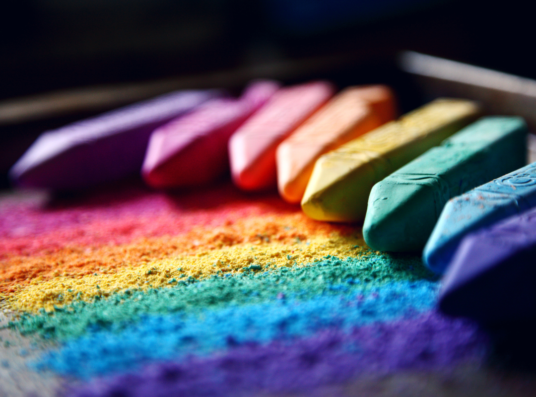
Each color carries psychological associations that can affect how your audience perceives your message. Here are some common interpretations:
- Red: Passion, energy, urgency. Use red to grab attention or highlight critical points, but sparingly, as it can also signify danger or aggression.
- Blue: Trust, calmness, professionalism. Blue is ideal for business presentations as it promotes feelings of stability and reliability.
- Green: Growth, health, and harmony. Green works well in presentations related to nature, wellness, or sustainability.
- Yellow: Optimism, creativity, warmth. Yellow can bring energy and positivity to your slides but should be used carefully as too much can cause strain.
- Black: Power, sophistication, authority. Black adds elegance and formality to presentations, making it suitable for corporate or luxury brands.
- White: Simplicity, clarity, cleanliness. White is neutral and creates space in your design, making your content feel clean and organized.
2. Choosing the Right Color Scheme
To design a cohesive presentation, you need a well-planned color scheme. A good rule of thumb is the 60-30-10 rule:
- 60% of the design should be your dominant color.
- 30% should be a secondary color that complements the dominant one.
- 10% should be an accent color used to draw attention to key elements.
This balance ensures that your slides are visually appealing without overwhelming your audience. Consider your topic, audience, and branding when selecting your palette. For example, a presentation for a financial institution might lean towards calming blues and greens, while a startup pitch might use vibrant colors like orange or yellow to communicate energy and innovation.
3. Using Color to Guide Attention
Color can direct your audience’s focus. By strategically using bright or contrasting colors, you can highlight key points, data, or call-to-action elements. For example, using a bold accent color to emphasize a headline or important statistic ensures that it stands out.
However, avoid overloading your presentation with too many colors, as this can create visual confusion. Stick to your selected color palette and apply it consistently throughout your slides.
4. Emotion and Mood
The emotional response to colors can vary depending on cultural and individual differences, but overall, color sets the tone of your presentation. A bright, warm color palette may create a sense of excitement or friendliness, while cooler tones can evoke professionalism or calm. Consider the mood you want to convey and adjust your color choices accordingly.
5. Contrast and Readability
While color is essential for evoking emotion, it’s also critical for ensuring readability. High contrast between your text and background makes your content easier to read. For example, dark text on a light background (or vice versa) provides good visibility. Avoid using similar shades for text and background, as this can make your presentation hard to follow.
6. Branding Consistency
If you’re designing a presentation for a company or client, it’s important to align the color scheme with their branding. Using brand colors consistently throughout the presentation not only reinforces brand identity but also creates a polished, professional look.
Conclusion
The psychology of color plays a significant role in how your presentation is perceived. By understanding the emotional and psychological effects of different colors, you can design slides that not only look good but also communicate your message more effectively. Remember to choose colors that align with your goals, guide your audience’s attention, and create the right mood for your presentation.
When used thoughtfully, color becomes a powerful tool in presentation design that enhances both visual appeal and message delivery.