CSS Grid Layout is a powerful tool that has revolutionized web design. By providing a grid-based framework, it simplifies the process of creating responsive, complex, and visually appealing layouts. Whether you’re an aspiring developer or a seasoned professional, understanding CSS Grid is essential for building modern, efficient web designs.
In this post, we’ll explore the basics of CSS Grid, how it compares to other layout systems, and its importance in front-end development. Along the way, we’ll include helpful examples, resources, and insights to help you master this transformative technology.
What is CSS Grid?
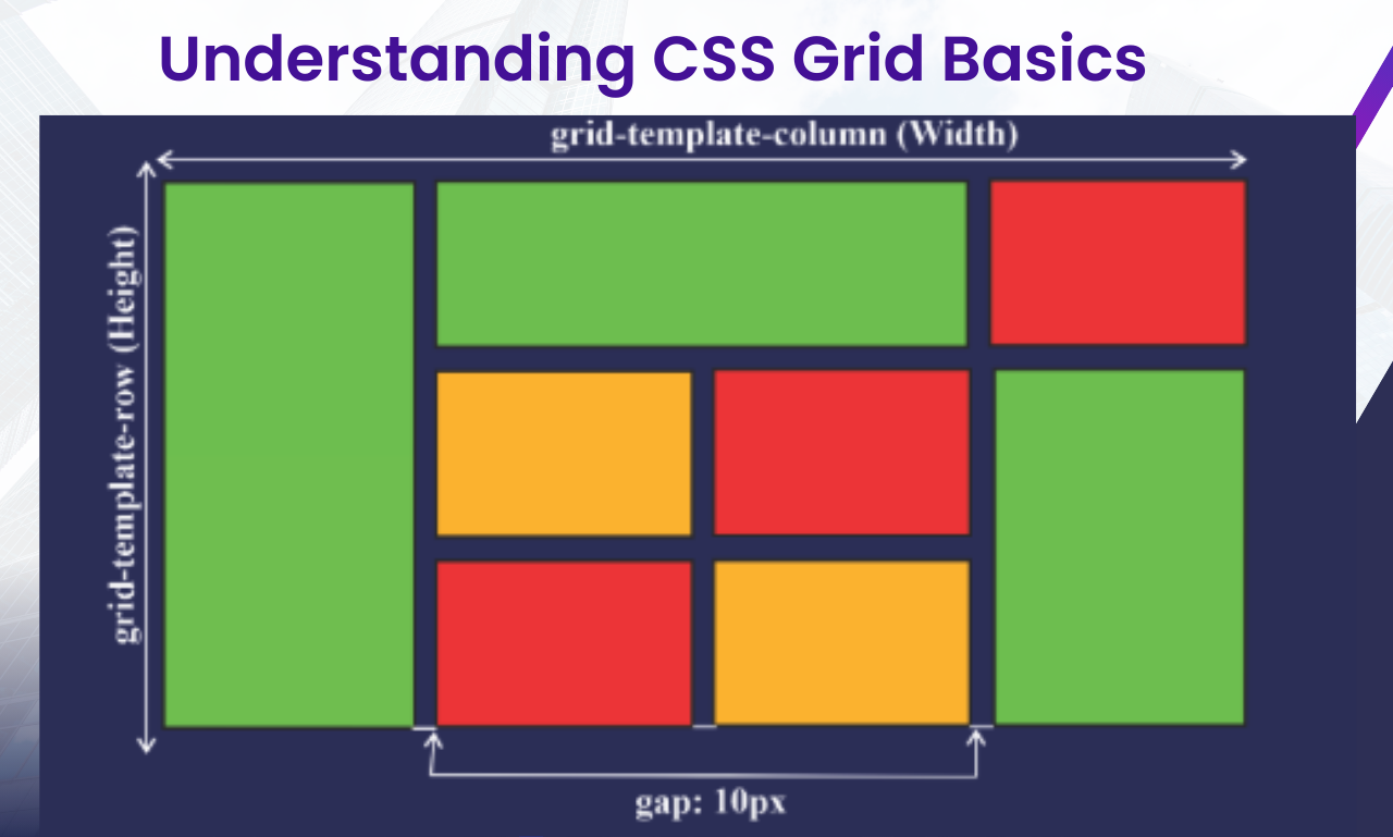
CSS Grid is a layout system specifically designed for building two-dimensional web layouts. Unlike other CSS layout methods, such as Flexbox (which is one-dimensional), Grid handles both rows and columns, giving developers greater control over layout design.
It allows you to create intricate designs by defining a container as a grid and placing items within that grid using straightforward rules.
Key Features of CSS Grid:
- Two-Dimensional Layout: Handles both rows and columns.
- Explicit and Implicit Grids: Define exact grid tracks or let the browser generate them automatically.
- Alignment Options: Align items with ease using grid alignment properties.
- Flexibility and Responsiveness: Adapt layouts effortlessly for different screen sizes.
“Great design is achieved when simplicity meets functionality.” – Anonymous
CSS Grid vs. Flexbox: When to Use Which
Both CSS Grid and Flexbox are essential tools in modern web design, but they serve different purposes.
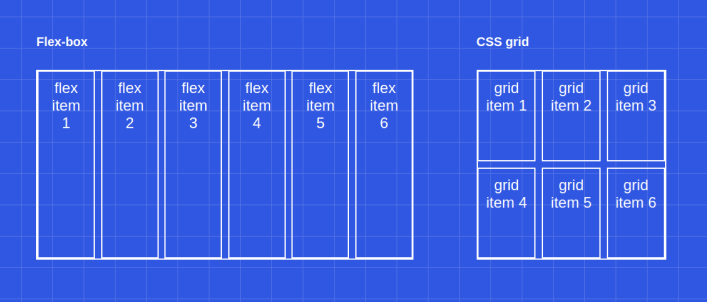
CSS Grid:
- Best for creating entire page layouts or large sections of a website.
- Focuses on both rows and columns simultaneously.
Flexbox:
- Ideal for arranging items within a single row or column.
- Emphasizes content flow and alignment in one direction.
For a deeper understanding of Flexbox, read this essential guide to modern web layouts.
The Basics of CSS Grid
1. Setting Up a Grid Container
To start using CSS Grid, declare a container as a grid by adding the display: grid; property:
cssCopy code.container {
  display: grid;
}
2. Defining Grid Tracks
You can define the number and size of rows and columns using grid-template-rows and grid-template-columns:
cssCopy code.container {
  display: grid;
  grid-template-columns: 1fr 1fr 1fr; /* Three equal columns */
  grid-template-rows: auto auto; /* Two rows with auto height */
}
3. Placing Items in the Grid
Position items using grid-row and grid-column properties:
cssCopy code.item1 {
  grid-column: 1 / 3; /* Span across two columns */
  grid-row: 1; /* Stay in the first row */
}
Benefits of CSS Grid
- Simplifies Layout Management: CSS Grid eliminates the need for complex float-based layouts or multiple nested containers.
- Responsive Design Made Easy: Media queries combined with grid properties allow for seamless responsiveness.
- Streamlined Code: Reduces the amount of code needed to achieve complex designs.
Learn more about combining CSS Grid with frameworks by exploring this introduction to front-end frameworks.
Creating a Responsive Layout with CSS Grid
Let’s build a responsive layout using CSS Grid and media queries.
HTML Structure:
htmlCopy code<div class="container">
  <div class="item">Header</div>
  <div class="item">Menu</div>
  <div class="item">Main Content</div>
  <div class="item">Sidebar</div>
  <div class="item">Footer</div>
</div>
CSS:
cssCopy code.container {
  display: grid;
  grid-template-columns: 1fr 2fr;
  grid-template-rows: auto;
  gap: 10px;
}

@media (max-width: 768px) {
  .container {
    grid-template-columns: 1fr;
  }
}
This layout adjusts from a two-column layout on larger screens to a single-column layout on smaller screens.
“The best designs are responsive, ensuring a seamless user experience on any device.” – Ethan Marcotte
Common CSS Grid Properties
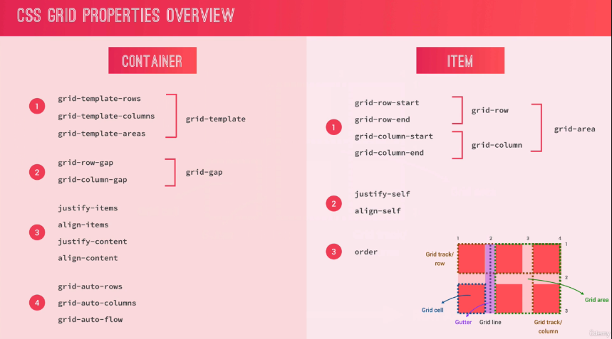
Here are some of the most commonly used properties in CSS Grid:
- grid-gap / gap: Adds spacing between grid items.
- justify-items: Aligns items horizontally within their grid cells.
- align-items: Aligns items vertically within their grid cells.
- grid-area: Defines an item’s position by specifying its row and column start and end.
Example:
cssCopy code.item {
  grid-area: 1 / 2 / 2 / 4;
}
Challenges in Learning CSS Grid
Like any new tool, CSS Grid has a learning curve. Beginners might find the terminology or syntax overwhelming. However, resources like Mastering CSS Basics offer a solid starting point for those new to web styling.
Advanced Techniques with CSS Grid
Once you’ve mastered the basics, explore advanced features like:
- Named Grid Areas:cssCopy code
.container { display: grid; grid-template-areas: "header header" "menu main" "footer footer"; } - Auto Placement: Automatically place items in the next available cell using
grid-auto-flow.
CSS Grid is an indispensable tool for modern web design. By mastering its fundamentals, you can create layouts that are not only aesthetically pleasing but also highly functional. Its ability to simplify responsive designs and streamline code makes it a must-have skill for front-end developers.
Take the next step in your CSS journey by experimenting with Grid in your projects and combining it with other layout systems like Flexbox for unparalleled design versatility.
